 Page top
 Previous
 Homepage
 Next
Next
Scatterplot

Description
Also known as a Scatter Graph, Point Graph, X-Y Plot, Scatter Chart or Scattergram.
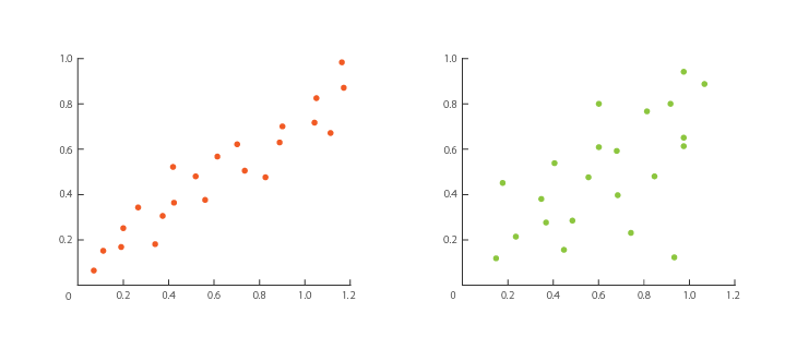
A Scatterplot places points on a Cartesian Coordinates system to display all the values between two variables. By having an axis for each variable, you can detect if a relationship or correlation between the two exists.
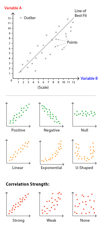
The kind of correlation can be interpreted through the patterns revealed on a Scatterplot. These are: positive (values increase together), negative (one value decreases as the other increases) or null (no correlation). The shape of the correlation can be described as: linear, exponential and U-shaped. The strength of the correlation can be determined by how closely packed the points are to each other on the graph. Points that end up far outside the general cluster of points are known as outliers.
Lines or curves can be displayed over the graph to aid in the analysis. This is typically known as the Line of Best Fit or Trend Line and can be used to make estimates via interpolation. A Line of Best Fit is drawn as close to all the points as possible to show how it would look if all the points were condensed together into a single line.
Scatterplots are ideal when you have paired numerical data and you want to see if one variable impacts the other. However, do remember that correlation is not causation and another unnoticed or indirect variable may be influencing the results.
Functions
Anatomy

Similar Charts
Tools to Generate Visualisation
Code-based:
amCharts (JS)
AnyChart (JS)
Apache ECharts (JS)
Chart.js (JS)
D3.js Graph Gallery (D3.js)
FusionCharts (JS)
Google Charts (HTML5)
Highcharts (JS)
JSCharting (JS)
Observable (D3.js)
Plotly (JS)
Python Graph Gallery (seaborn, matplotlib, plotly)
React Graph Gallery (React/JS)
R Graph Gallery (R: ggplot2)
Vega
Vega-Lite
ZingChart (JS)
Webapp:
Datavisual
Datawrapper
Datylon
Flourish
Google Docs
Infogram
Chartle
RAWGraphs
Desktop App:
Adobe Illustrator
Apple Numbers
Microsoft Office, PowerBI
Tableau


