 Page top
 Previous
 Homepage
 Next
Next
Pictogram Chart

Description
Also known as Pictograph Chart, Pictorial Chart, Pictorial Unit Chart, Picture Graph.
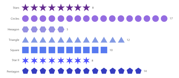
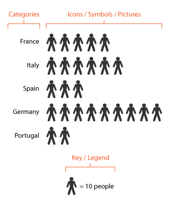
Pictogram Charts use icons to give a more engaging overall view of small sets of discrete data. Typically, the icons represent the data’s subject or category, for example, data on population would use icons of people. Each icon can represent one unit or any number of units (e.g. each icon represents 10). Data sets are compared side-by-side in either columns or rows of icons, to compare each category to one another.
The use of icons can sometimes help overcome differences in language, culture and education. Icons can also give a more representational view of the data. So for example, if your data is of 5 cars, you show 5 icons of cars in the chart.
Two things to avoid when using Pictogram Charts are:
Using them for large data sets, which makes values on the chart hard to count.
Displaying partial icons, as this can add confusion to what they represent.
Functions
Anatomy

Tools to Generate Visualisation
Code-based:
Apache ECharts (JS)
jChartFX (JS)
JSCharting (JS)
Vega-Lite
ZingChart (JS)
Webapp:
Flourish
Infogram
Vizzlo
Desktop App:
Adobe Illustrator


