 Page top
 Previous
 Homepage
 Next
Next
Choropleth Map

Description
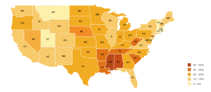
Choropleth Maps display divided geographical areas or regions that are coloured, shaded or patterned in relation to a data variable. This provides a way to visualise values over a geographical area, which can show variation or patterns across the displayed location.
The data variable uses colour progression to represent itself in each region of the map. Typically, this can be a blending from one colour to another, a single hue progression, transparent to opaque, light to dark or an entire colour spectrum.
One downside to the use of colour is that you can't accurately read or compare values from the map. Another issue is that larger regions appear more emphasised then smaller ones, so the viewer's perception of the shaded values are affected.
A common error when producing Choropleth Maps is to encode raw data values (such as population) rather than using normalized values (calculating population per square kilometre for example) to produce a density map.
Functions
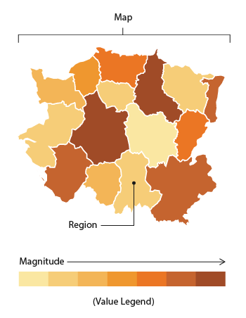
Anatomy

Similar Charts
...Tools to Generate Visualisation
Code-based:
amCharts (JS)
AnyChart (JS)
d3-geomap (JS + D3.js)
D3.js Graph Gallery (D3.js)
FusionCharts (JS)
Google Charts (HTML5)
Highcharts (JS)
JSCharting (JS)
Kartograph (JS or Python)
Mike Bostock’s Block (D3.js)
Plotly (JS)
Polymaps (JS)
Python Graph Gallery (geopandas, geoplot, folium, plotly)
R Graph Gallery (R: leaflet + ggplot2)
Vega
Vega-Lite
ZingChart (JS)
Webapp:
Columns.ai
Datamatic
Datawrapper
Flourish
Google Docs
Infogram
Mapbox Studio
Slemma
Visme
Desktop App:
ArcGIS Insights
Stata
Tableau

